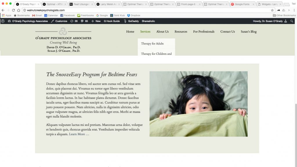
Problem:
With persistent nav in Optimal theme v. 1.5, you scroll down and trigger the persistent navigation at top with content scrolling beneath. But sadly, if you roll over the nav, the dropdown menus (or submenus if you like) are cut off at the edge of the persistent nav:
Here’s the fix, thanks to Wes, in Appfinite’s Forum:
http://appfinite.com/topic/epik-navigation-appearing-behind-headline-on-pages/
Here’s the original top function inside /wp-content/themes/optimal/js/global.js:
jQuery(function( $ ){
// Add shrink class to site header after 50px
$(document).on(“scroll”, function(){if($(document).scrollTop() > 250){
$(“.site-header”).addClass(“shrink fadeup-effect”);} else {
$(“.site-header”).removeClass(“shrink fadeup-effect”);
}});
To fix, replace that section with this:
jQuery(function( $ ){
// Add shrink class to site header after 50px
$(document).on(“scroll”, function(){if($(document).scrollTop() > 250){
$(“.site-header”).addClass(“shrink”);} else {
$(“.site-header”).removeClass(“shrink”);
}});
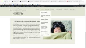
And, voilà! Normal menus, not cut off:
 Have you ever finished a post (or page) and then been disappointed with how the page title breaks when viewed on your computer? Such as, when one word is hanging out all by itself on its own line? (That lonely word is called an “orphan” in old-fashioned proofreader-speak.) See example to the right: